Heineken
Near and Far London to New York, Singapore to Shanghai
Industry
Consumer
Location
Global
Intent
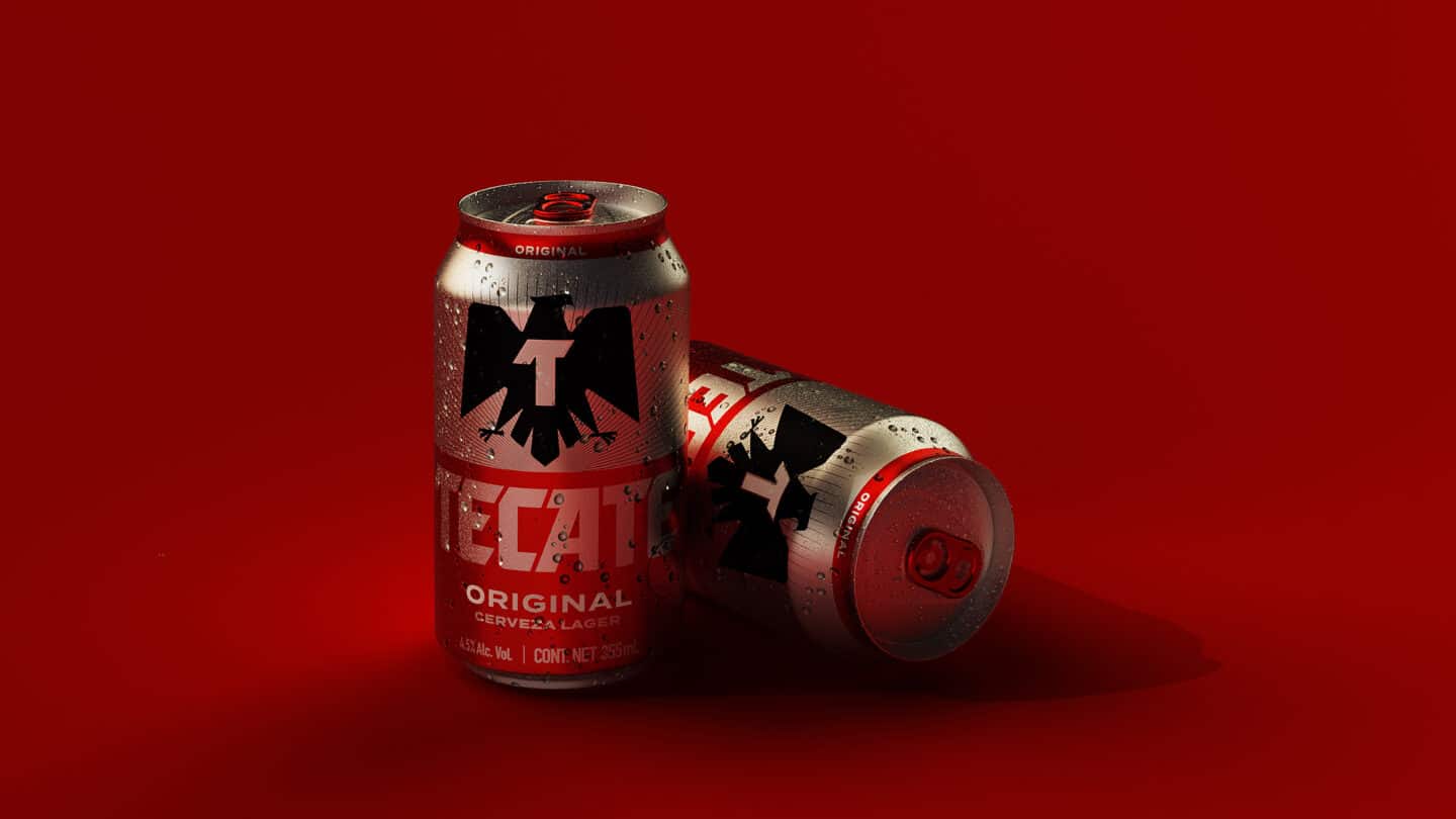
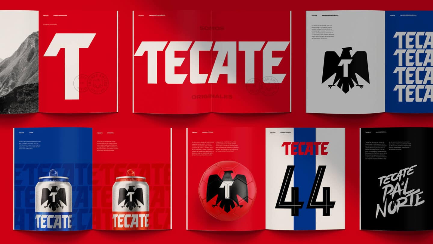
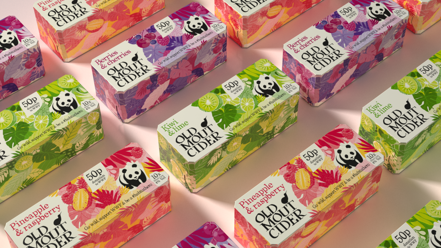
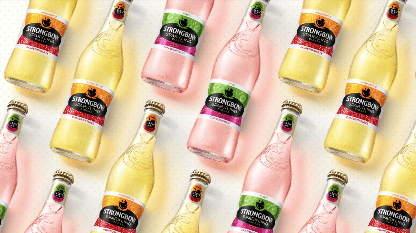
Having worked with Heineken both globally and locally for over 11 years our challenges have been near and far, big and small, requiring both head in the clouds thinking and feet on the ground agility. Whether that be rejuvenating Mainstream like Tecate, Amstel and Bia Viet to crafting Premium like Bohemia and ABC, bringing next gen relevance to Cider with Orchard Thieves or innovating Limited Edition for Tiger.
Throughout this time, whatever the challenge our intent has always been to deploy our unrelenting enthusiasm to ensure we don’t do things by halves. Establishing iconic brand identities that culturally connect is not an either/or, it means having a global perspective whilst being proud to be local.

The challenge
More than ever the world of beer needs to connect with the generations of today and tomorrow. For with every generation their comes a shift in attitudes and taste, behaviour and tech, each having different priorities and influences that that change the way they buy. Brands needs to match this dynamism, with an approach that is iconically always new – dynamic brand assets, dynamic brand content, dynamic brand world identity systems capable of engaging with people, whoever, whatever, wherever, whenever, to ensure the brand remains relevant in the moment.
AI accelerates this capability, requiring us to potentially be in multiple markets, addressing not 4 personas or 4 segments but rather 400 meanings that we needed to build brands for a hyper-personalised world that is even more human to human. Not despite of this but because of this, we needed to craft aesthetically arresting iconic design. Brand design assets that work in a blink of an eye, that are fit for a digital shorthand world (not just a longhand analogue one). As well as developing primary and secondary brand design assets that create new stories in flexible yet cohesive ways across multiple touchpoints.

The idea
The need for this human to human approach is why everything we do starts with the human insight that guides the brand’s proposition, we then translate that strategy into design – that visually expresses the idea we want hardwire meaningfully in peoples hearts and minds. Think of it as distinctive brand assets as idea. In this way we can consistently apply those assets as idea wherever people connect with the brand.
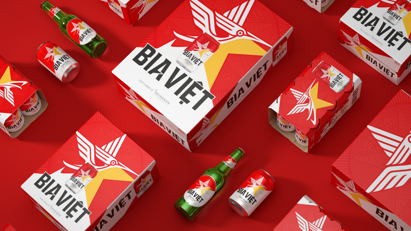
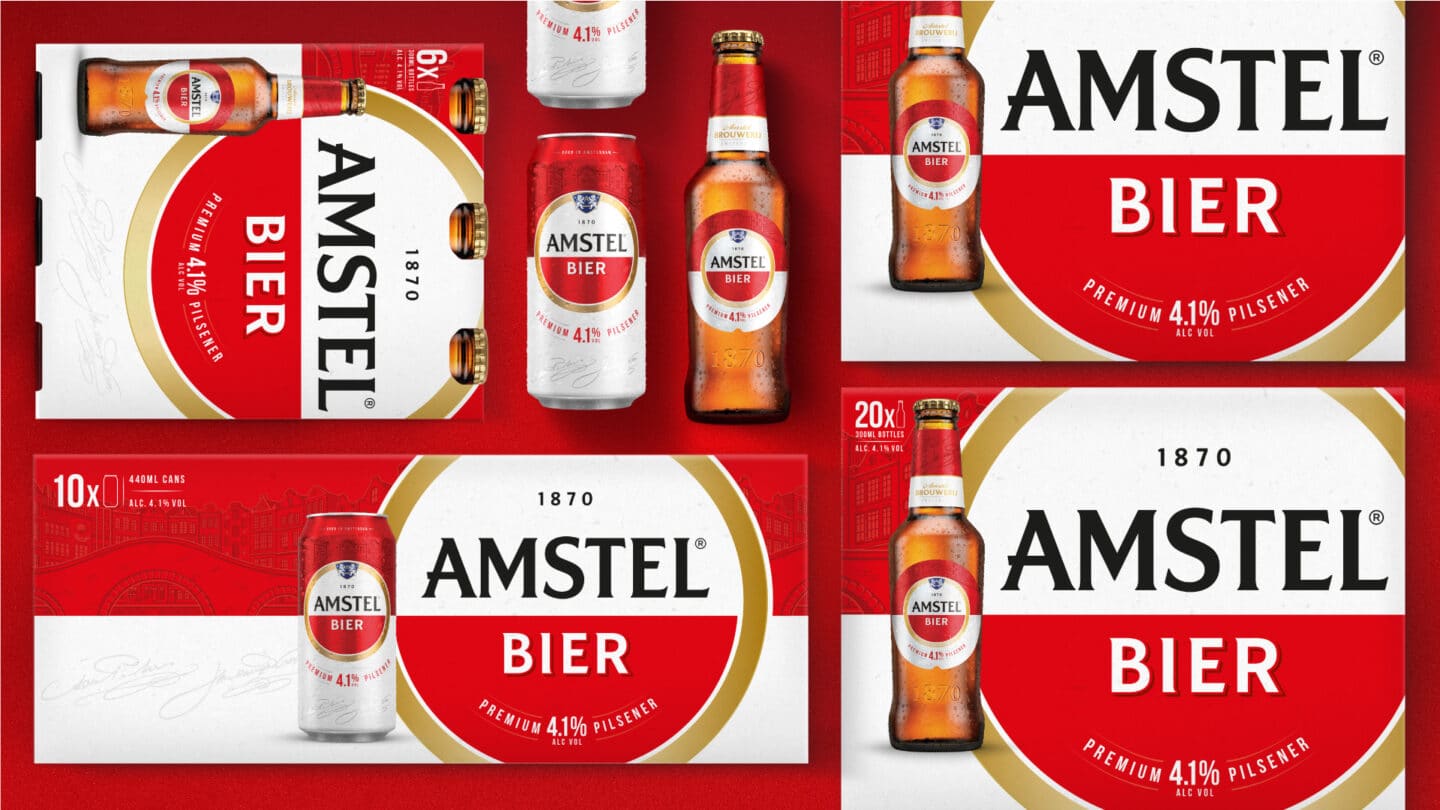
We see this approach brought to life as the Bia Viet’s Lac bird, becomes a powerful symbol of Vietnamese pride and progress. Whilst Amstel’s iconic red and white circle and split forms the foundation of a brand identity system that empowers local markets to deliver local design execution, whilst ensuring the brand remained instantly recognisable across 180 markets.

The impact
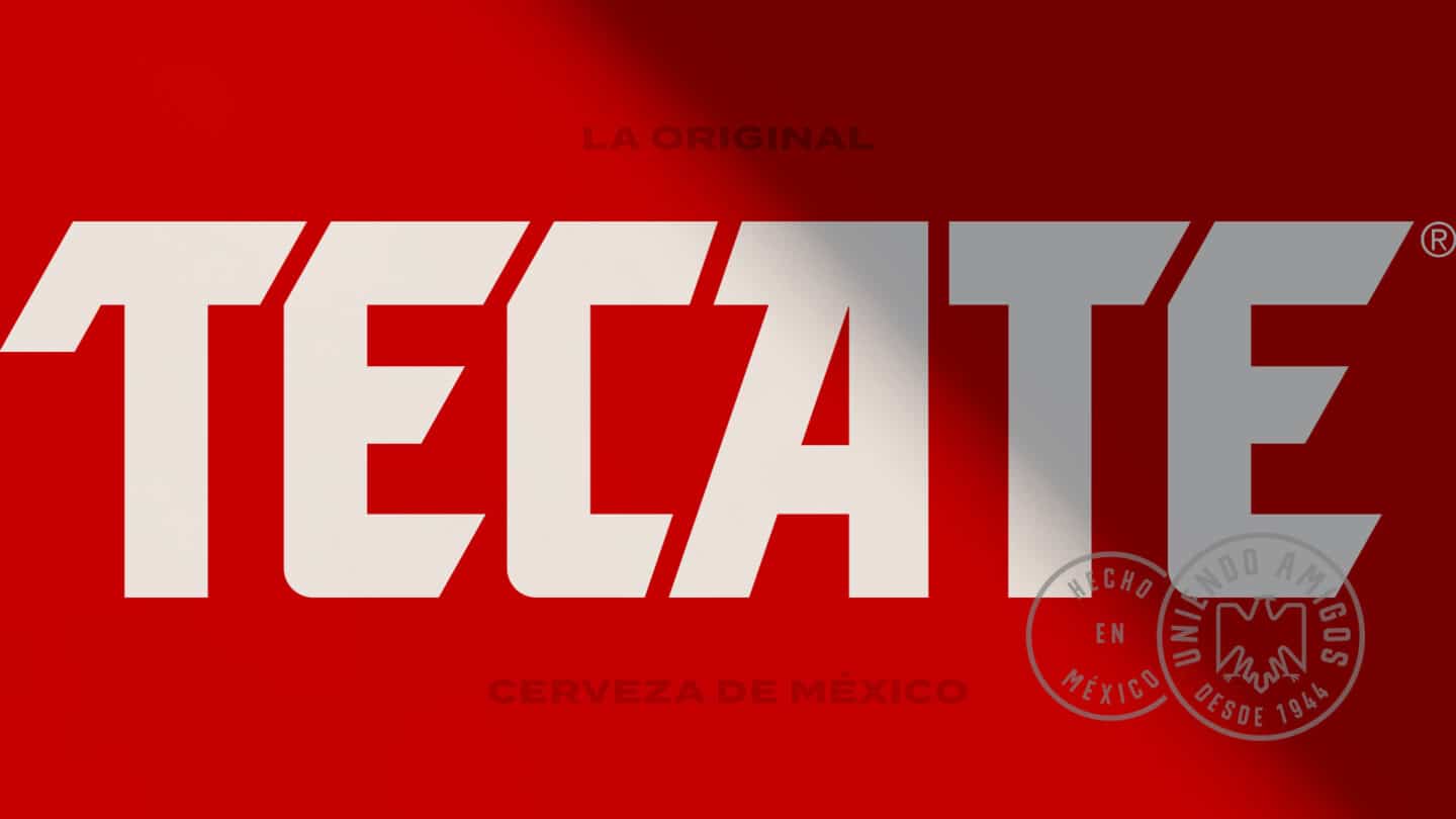
As Tecate’s revitalized eagle confidently encourages a younger, more progressive generation of men to fly and shed the hackneyed male stereotypes and machismo storylines that once defined its identity. In a similar fashion Orchard Thieves iconic Fox leaves behind the bucolic design tropes of cider to embrace a more relevant and exciting urban landscape.
