Freedom, choice and empathy the new intent of contraceptive design

Deborah Stafford-Watson
Head of Strategy, London
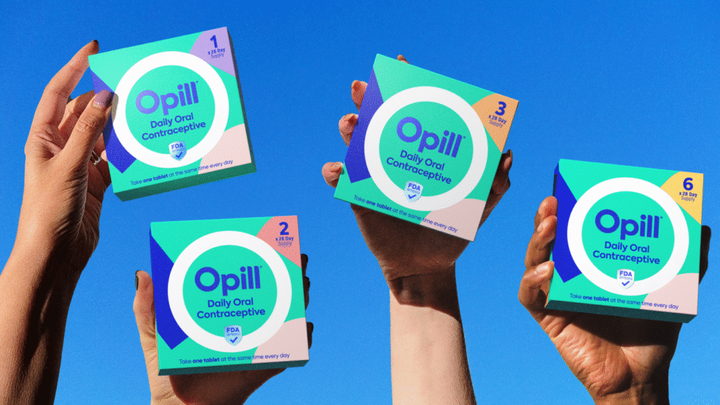
A women’s health product? For periods? Better make it pink then…. Thankfully, long gone are the days of stereotypical design choices in women’s health. Women have voted with their wallets and embraced brands that speak more to their real experiences and seek to solve real issues, but there’s still so much more to be done. In almost every global market, there’s increasing recognition of the gender health gap. Women can feel dismissed; their health concerns not taken seriously with products and services feeling irrelevant and inaccessible. There’s not only a need for more investment and understanding, but a shift in the way brands approach the design of products and services for women’s health. Design can play a powerful role in signaling this intent as we found with our groundbreaking design for Opill – the US’s first over the counter contraceptive pill.
Freedom from stigma and shame.
Brand and design should engage women to the point that they no longer feel the need to hide their experiences. We’ve seen a huge shift in this space from brand platforms like Hers, campaigns from established brands like BodyForm and digital trackers such as Flo Health but while normalisation is an essential ambition for brands in this space, not every brand needs to be an activist. Simple and uncomplicated storytelling – through universal symbolism like that of Opill’s ‘O’ – combined with warmth and approachability in language can deliver a sense of familiarity and freedom. Complexity is the enemy of comfort and by developing visual and verbal assets that are simple, clear and relatable, we were able to reject “discreet” femcare signals that may inadvertently contribute to contraception’s long-held legacy of shame
Designing with, not for, women.
Traditional female codes of design have only served to shroud women’s experiences of various health conditions – handing designers a huge responsibility to reverse the status quo. It’s a goal that begins with listening to, and elevating, women’s voices. And avoiding one-size fits all solutions. For example, with menopause set to affect over a billion people globally by the year 2030 – each experiencing different and completely personal symptoms, it can be a dizzyingly complex space to design for. When developing the Opill visual identity system, the use of abstract shapes and diverse illustration allowed women and people of all backgrounds (age, ethnicity, orientation) to find a place to self-identify with the brand. We listened and learnt from women throughout the process to find the right balance of standout appeal and scientific efficacy to inspire confidence and trust. Listening and co-creating are powerful tools in getting this right.
Consider the whole person, not just the issue.
While a cold or a stomach bug is an on-off incident demanding action in the moment, gender-specific issues – for example, period-induced migraines, or the misery of UTIs – are typically ongoing or cyclical in nature. This means designers need to think beyond the assumed dichotomy of a problem-solution set up, and instead design brands built for lasting partnership. People will tell you that ‘Gen Z broke the marketing funnel’ but in the world of women’s health, the path to purchase is rarely linear. Family and friends are often the biggest source of health information but social media’s influence can’t be ignored. Building a digital first brand, that shows up where our customers are in a way that’s relevant and culturally resonant was essential for Opill’s success.
At a point where many women still feel disempowered by healthcare systems that systematically overlook their needs, design can help by crafting a new type of meaningful brand language. As the journey for Opill® shows, it’s possible to build a brand that is approachable, aspirational and courageous in design; all while maintaining a baseline of clinical competence. And there’s so much more we can do in women’s health.