Horlicks
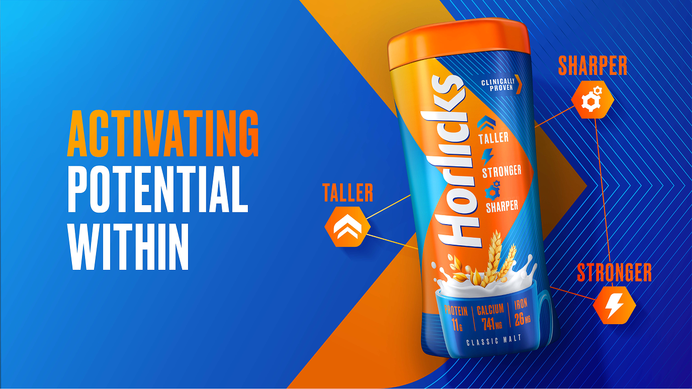
Activating potential within
Industry
Consumer
Location
APAC
Services
Brand Architecture, Brand Identity, Brand Strategy, Brand World, Packaging Design, Portfolio Strategy
Intent
To reestablish Horlicks as the trusted choice for family nutrition by blending scientific credibility with a modern, approachable identity.
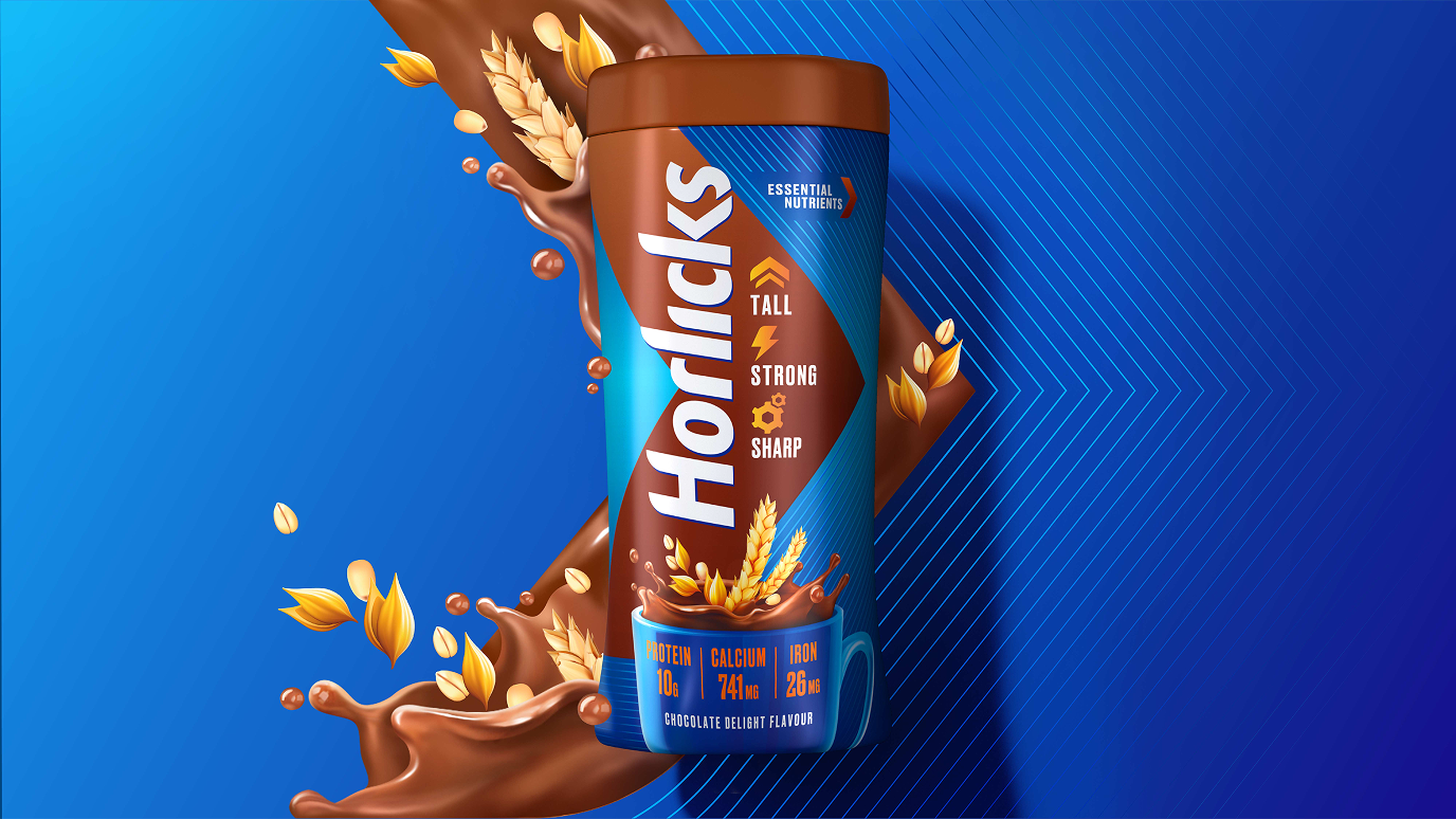
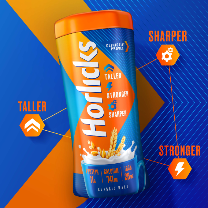
Horlicks fell short in perceived functional benefits and scientific credentials.
The challenge
The rapidly growing Health Food Drinks category in India has led to a crowded and saturated market landscape. Despite being a household name for over 40 years, Horlicks fell short in perceived functional benefits and scientific credentials compared to its competitors. The brand no longer aligned with evolving perceptions and trends in family nutrition across India. We set out to align the Horlicks brand experience with its holistic nutrition narrative and capture the attention of today’s families with refreshed visuals and compelling messaging.
The idea
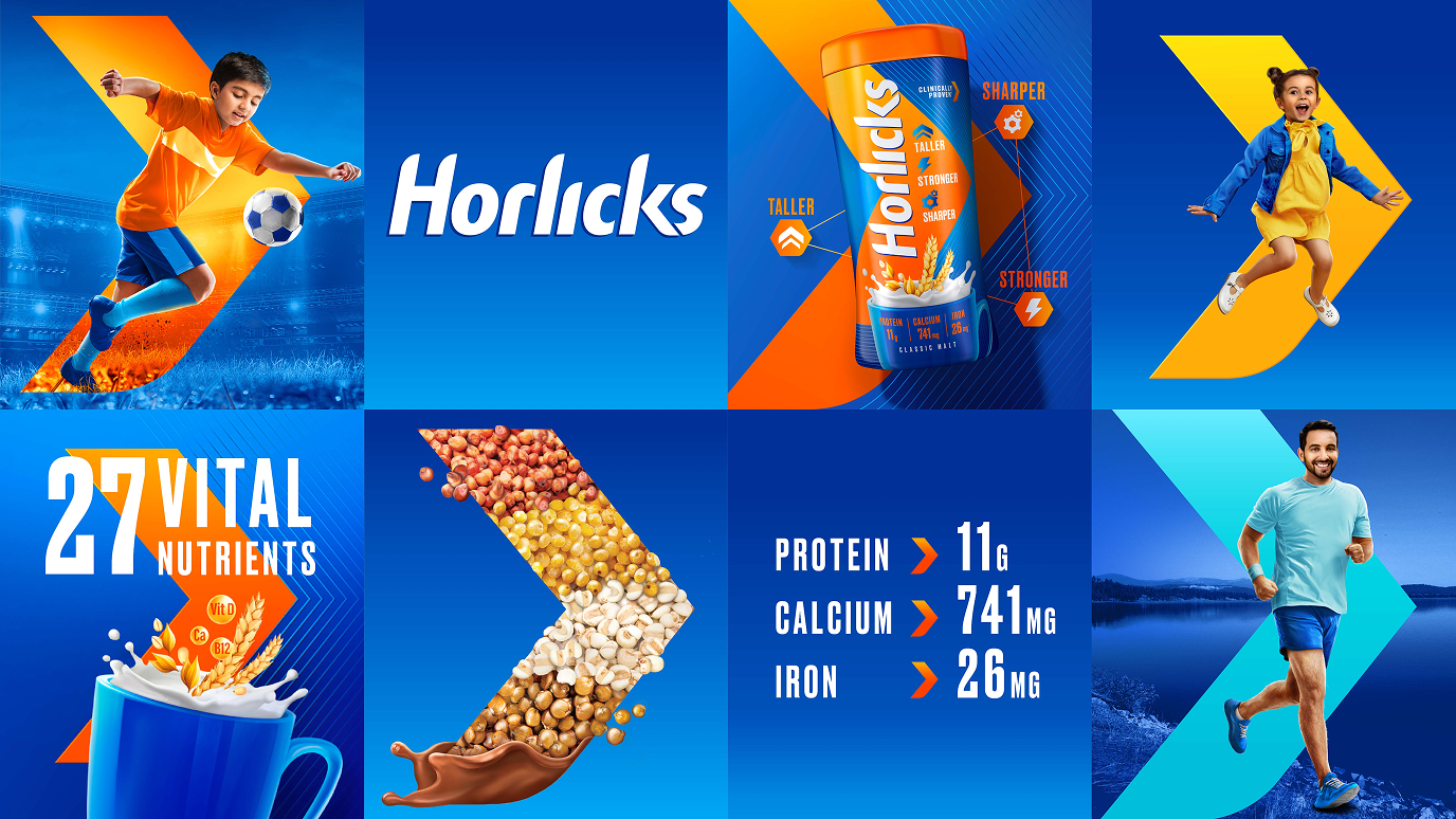
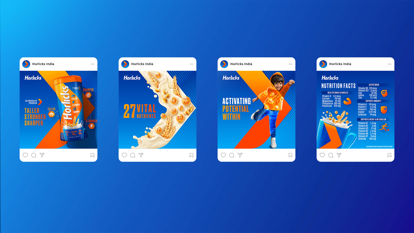
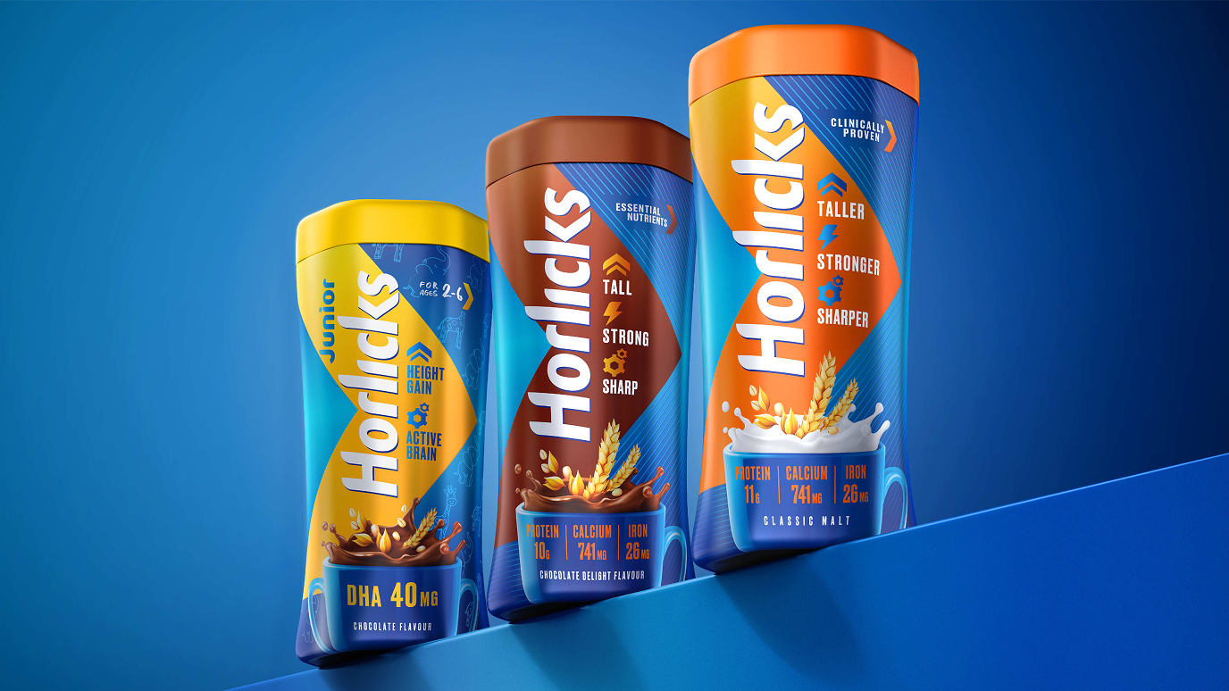
We anchored the brand around the idea of being an “Activator of Potential.” Crafted with moms and families in mind, our redesign emphasized the science behind Horlicks, demonstrating its tangible nutritional benefits. By balancing scientific expertise with approachability, we showcased Horlicks’ benefits in a way that could resonate with moms everywhere. This approach informed the design of new Distinctive Brand Assets and a refreshed visual identity, all highlighting Horlicks’ role as the go-to-choice in specialized nutrition for a child’s optimal growth.

The impact
The redesign drove significant improvement in consumer perception and purchasing behavior. The updated packaging achieved a 77% visual appeal rating (up from previous levels) and a 55% uniqueness rating.