The Week
Connecting with readers on a deeper level
Industry
Corporate
Location
North America
Intent
To cut through the noise and win over new audiences by translating The Week’s uniquely balanced perspective into a magnetic brand identity.
The challenge
The Week is an icon of the newsstand, part of a group of respected magazines that cover weekly political commentary. It’s unique in delivering a balanced perspective by pulling together news from a variety of trusted sources, helping readers to stay informed and also to form their own conclusions without political bias. While The Week has a loyal readership, it sought to expand its audience through a refreshed and captivating identity in digital and print campaigns.
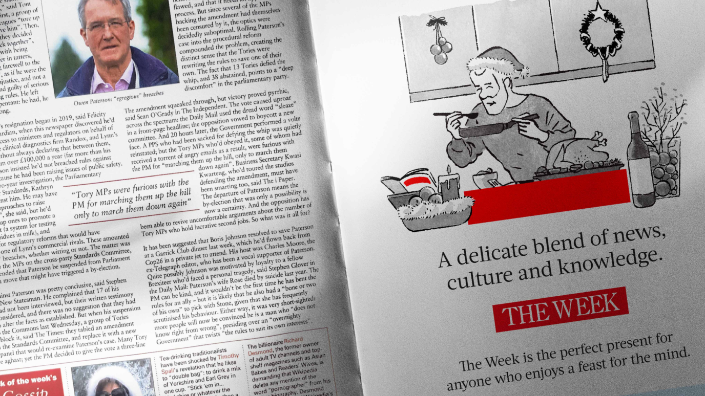
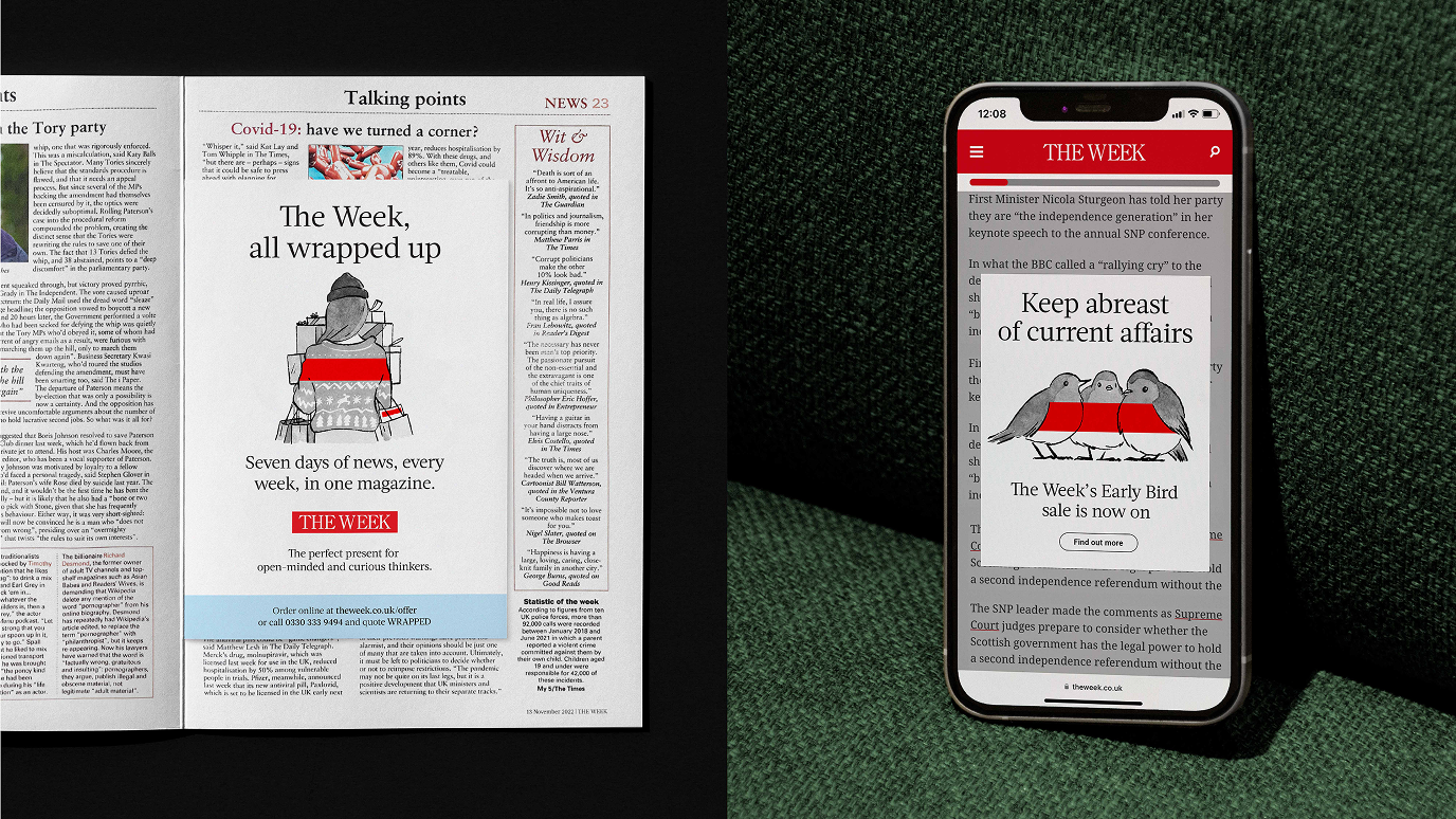
The publication is known for its colorful and illustrated covers depicting political satire, but there was little to play with in the brand toolkit. The solution, however, was hiding in plain sight: the iconic red masthead. We set out to create a visual identity system that reflects the publication’s balanced editorial style and attracts a new audience of readers.
The idea
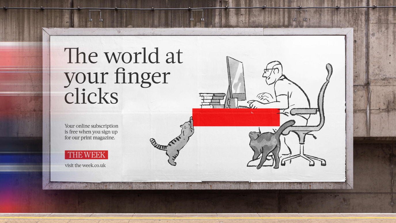
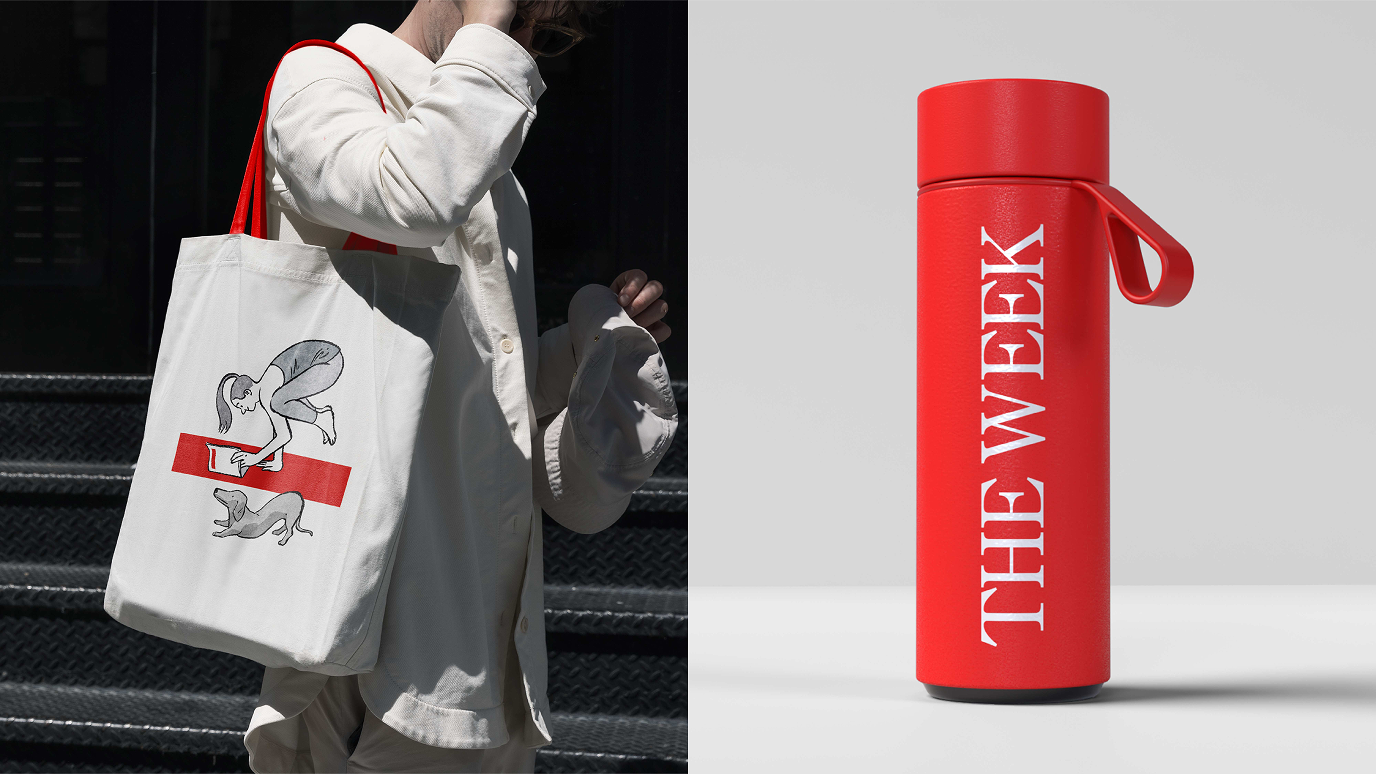
We recognized the powerful, iconic shorthand of the red masthead and transformed it into a stage for witty, idea-driven copy and the whimsical illustrations of artist Luis Mendo. Mendo’s delightful pen-and-ink illustrations act as a perfect complement to The Week’s vibrant cover art, allowing both to co-exist in the same brand world with ease. We embraced the iconic red bar as a flexible canvas on which to craft stories that would delight and engage new readers, from summer subscription giveaways to early bird deals and holiday gift promotions.
The revamped visual identity is a dynamic tool for storytelling, with the ability to flex and cover stories from all angles. It translates The Week’s measured news voice into a fresh new look that could come to life in different ways and connect with different audiences.
We transformed the iconic red masthead into a stage for witty, idea-driven copy.
The impact
The creative and copy changes across The Week’s in-magazine advertising led to impressive results: orders increased by 27% compared to the four months prior to the new branding. Year-over-year customer referral rate from The Week’s website rose by 21%. A two-week OOH campaign across nine major Tube stations drove an 82% increase in brand PPC orders nationwide and a 103% rise in London PPC orders compared to the prior four-week period prior. The new identity has given The Week the tools and framework to build a consistent brand identity across all customer touchpoints.