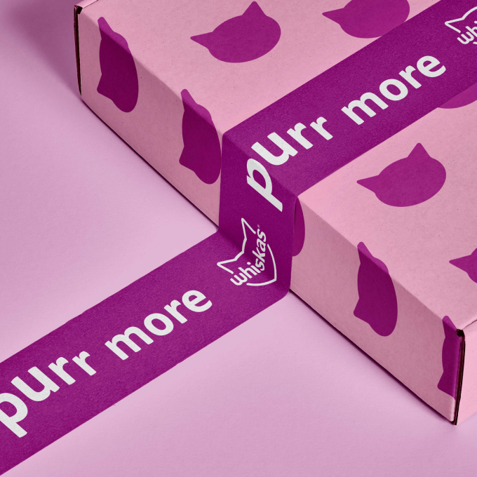
Whiskas
Bringing a new cattitude to pet food
Industry
Consumer
Location
Europe
Intent
To turn WHISKAS into a modern icon that captures hearts, deepens bonds, and takes pride of place in every cat-loving home.
The new design principles modernized brand assets and put the pet parent first.
The challenge
Since 1936, WHISKAS has been a leading brand in the pet care category, committed to making all cats purr more with a delicious portfolio of products. But the brand’s identity was built for an analogue world — and research confirmed that consumers saw the brand as outdated and disengaged.
The team needed our help to develop an updated brand identity and portfolio packaging design that would connect with pet parents and stand out in the current competitive pet care market. We set out to refresh WHISKAS’ distinctive assets to deliver a modern brand identity that stays true to its mission of deepening bonds between pets and pet parents.
The idea
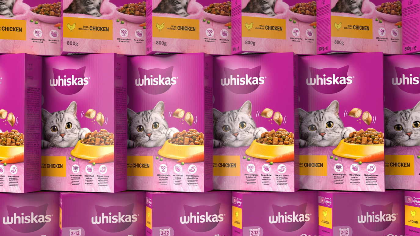
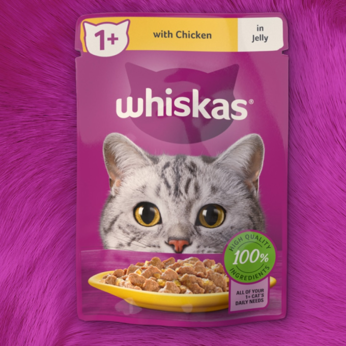
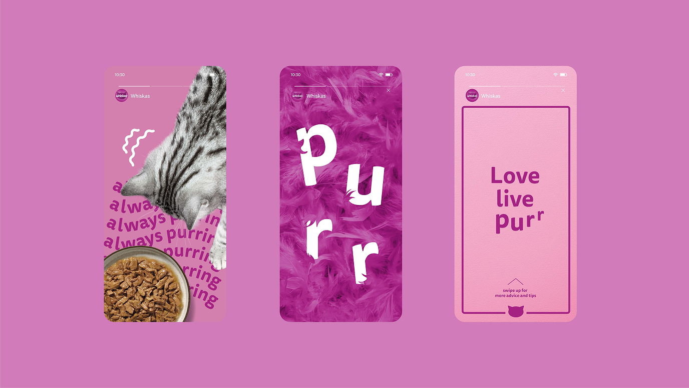
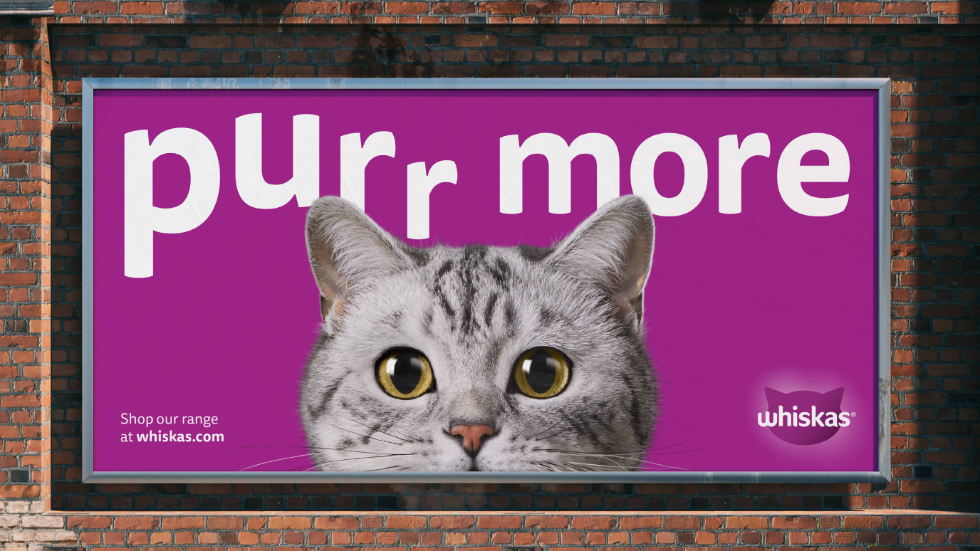
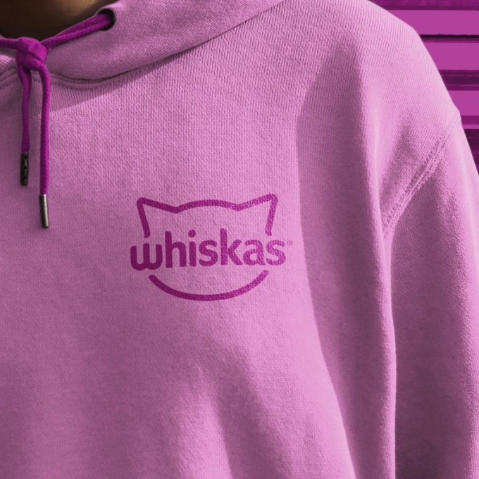
We reimagined WHISKAS’ assets for a more engaged, digital brand and created design elements that could flex into the future and evolve along with the pet care category. Central to the update was highlighting the special relationship between cat and pet parent in different ways, on and off pack. First, we brought the iconic ‘W’ brand flag into the brand mark, which playfully imitates a cat’s mouth. Tommie the cat, once static and passive, now comes to life at the heart of the pack, with her expressive cat eyes front and center, looking directly at the pet parent.
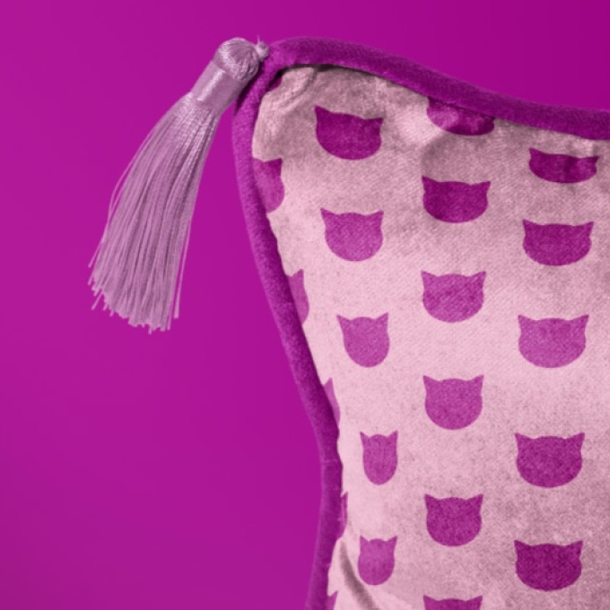
Our distinctive purple creates a strong brand block on shelf, and a. clear navigation system with bold and graphic colors, icons, and claims help consumers navigate with ease. With clear design principles and modernized brand assets that put the pet parent first, the re-invented brand is instantly recognizable while staying unmistakably WHISKAS.
The impact
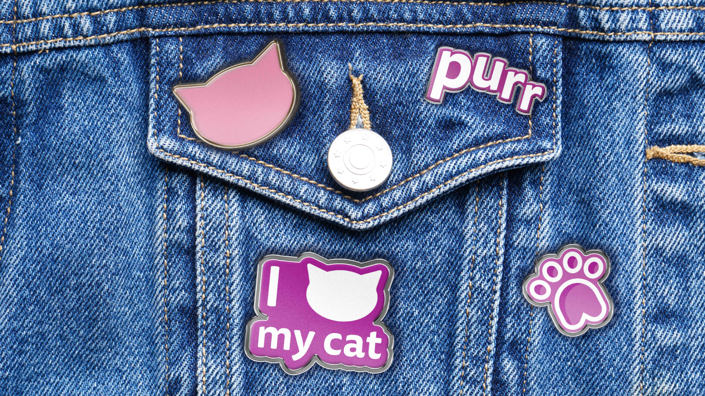
The updated identity has transformed WHISKAS into a modern, emotionally engaging brand capable of capturing pet parents’ hearts all over the globe. The new branding rolled out across markets starting in early 2023, with exceptional year-to-date results showing an increase in retail sales compared to the previous year.

