Opill
Reshaping the parameters of women’s health
Industry
Healthcare
Location
North America

The intent
To revolutionize reproductive health with a groundbreaking brand that captures the feelings of empowerment and freedom in this landmark moment.

The challenge
For the first time ever, women in America can purchase birth control over the counter without a prescription, addressing barriers faced by one-third of U.S. women in accessing contraception. As the first product of its kind, Opill represents a landmark moment in history for women’s health.
We set out to create a powerful brand identity that would capture the groundbreaking nature of the product on-and off-pack, and define a new set of design standards for reproductive health products.
Opill’s design system breaks free from the norms of traditional healthcare.

The idea
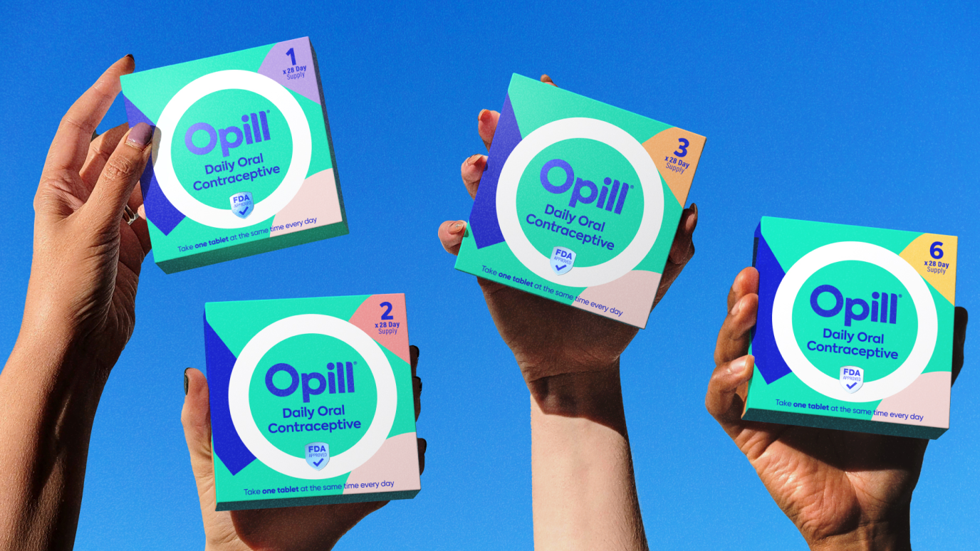
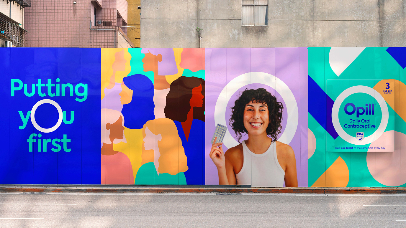
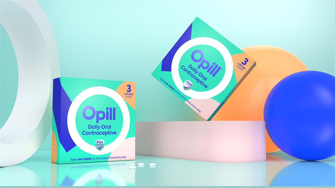
Opill’s new brand identity acknowledges its role in reshaping access to reproductive health, with a design system that breaks free from the norms of traditional healthcare. The identity centers around its O-shaped brandmark, a bold emblem for protection, simplicity, and ease of use. The color palette features a background of vibrant teal, alongside pops of coral, lilac, orange, blush, and yellow that appear in free-form shapes.
The font, with its open and rounded typeface, adds warmth and approachability, while references to classic Rx language underscore the product’s credibility. The result is a visual and verbal brand language that signals freedom, access, and a new era in product branding for reproductive self-care.

The impact
As the first FDA-approved, over-the-counter daily birth control pill available for sale in the U.S. without a prescription, Opill’s launch was covered by leading outlets including CNN, The New York Times, Fast Company, NBC News, and Forbes. In April 2024, just a month after launch, Perrigo announced a multi-year partnership between Opill and the Women’s National Basketball Association (WNBA) that would redefine contraception accessibility.

“Great step forward” for birth control accessibility says director of family planning at NYU Langone Hospital
DIRECTOR OF FAMILY PLANNING
NYU Langone Hospital