Ribena
A juicy new look for every generation
Industry
Consumer
Location
Europe
Intent
Ribena has always been more than just a drink. To many, it’s the nostalgia of home, woven into everyday moments and memories. Our challenge was clear: to help Ribena stand out again without losing the emotional connection that makes it so loved.
This wasn’t a task of reinvention, but one of reconnection. Our strategic intent was to strike “familiar difference” – refreshing the identity in a way that honoured its timeless character.
The Challenge
Prior to the relaunch, Ribena’s brand team embarked on extensive Gemba research, a technique utilised by Japanese parent company Suntory, involving intensive consumer listening and interviews at the earliest stage of product and strategy development to gain a deep understanding of the brand’s DNA. This allowed Ribena to deploy Suntory’s Core Brand Innovation (CBI) process, which involves continual prototyping and testing, putting the consumer at the heart of the design.
We put consumers at the heart of the design process
The Idea
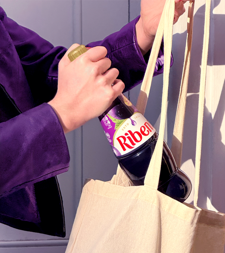
Working with Ribena’s brand team and powered by their extensive consumer insights, we were able to rebuild Ribena from the ground up, creating an uplifting visual identity with a warmth and familiarity that reminds us of the taste of home.
There’s no taste like home
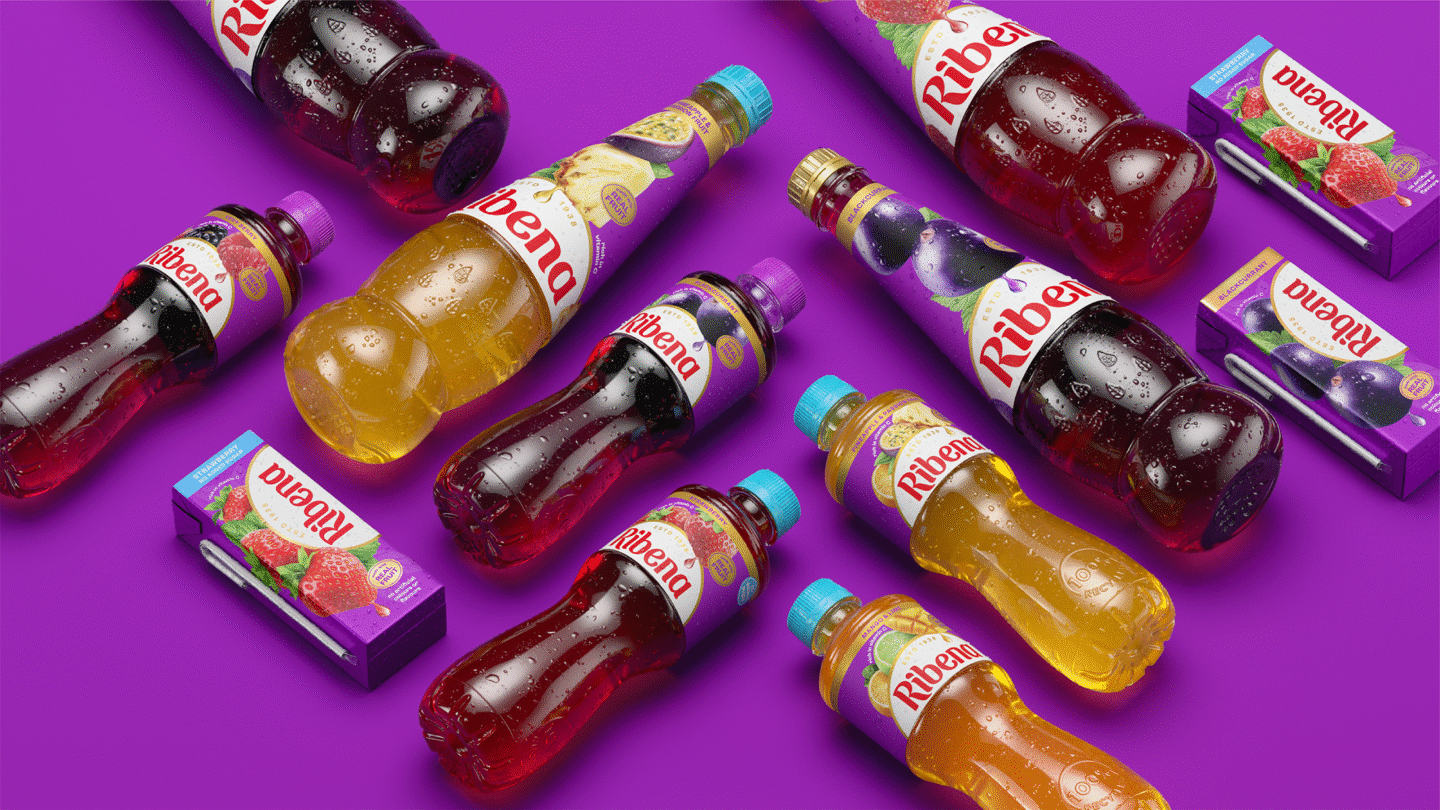
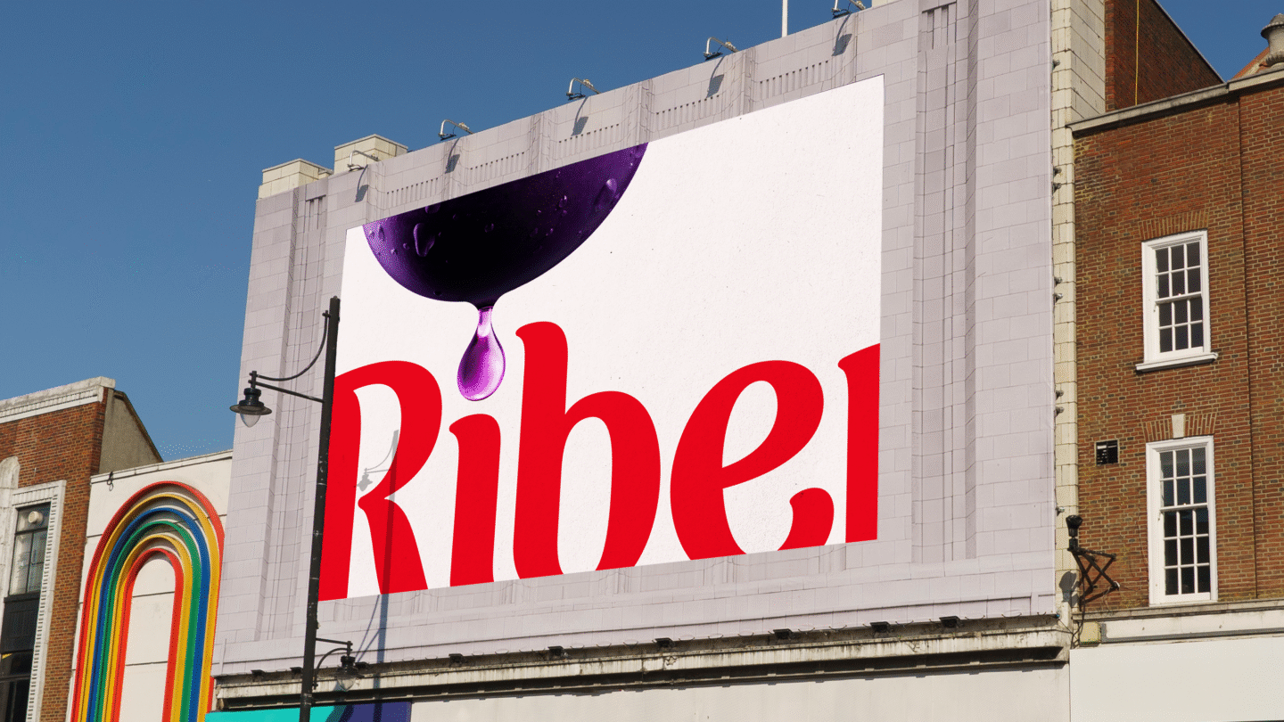
Collaborating with typographer Luke Ritchie, Ribena’s wordmark has been refined, reintroducing a straight baseline and the logo’s signature red, to reflect a sense of pride and trustworthiness. The letterforms are now plumper and juicier, with sharp angles swapped for playful flicks and fluid terminals, bringing back a sense of fun and flavour that’s unmistakably Ribena.
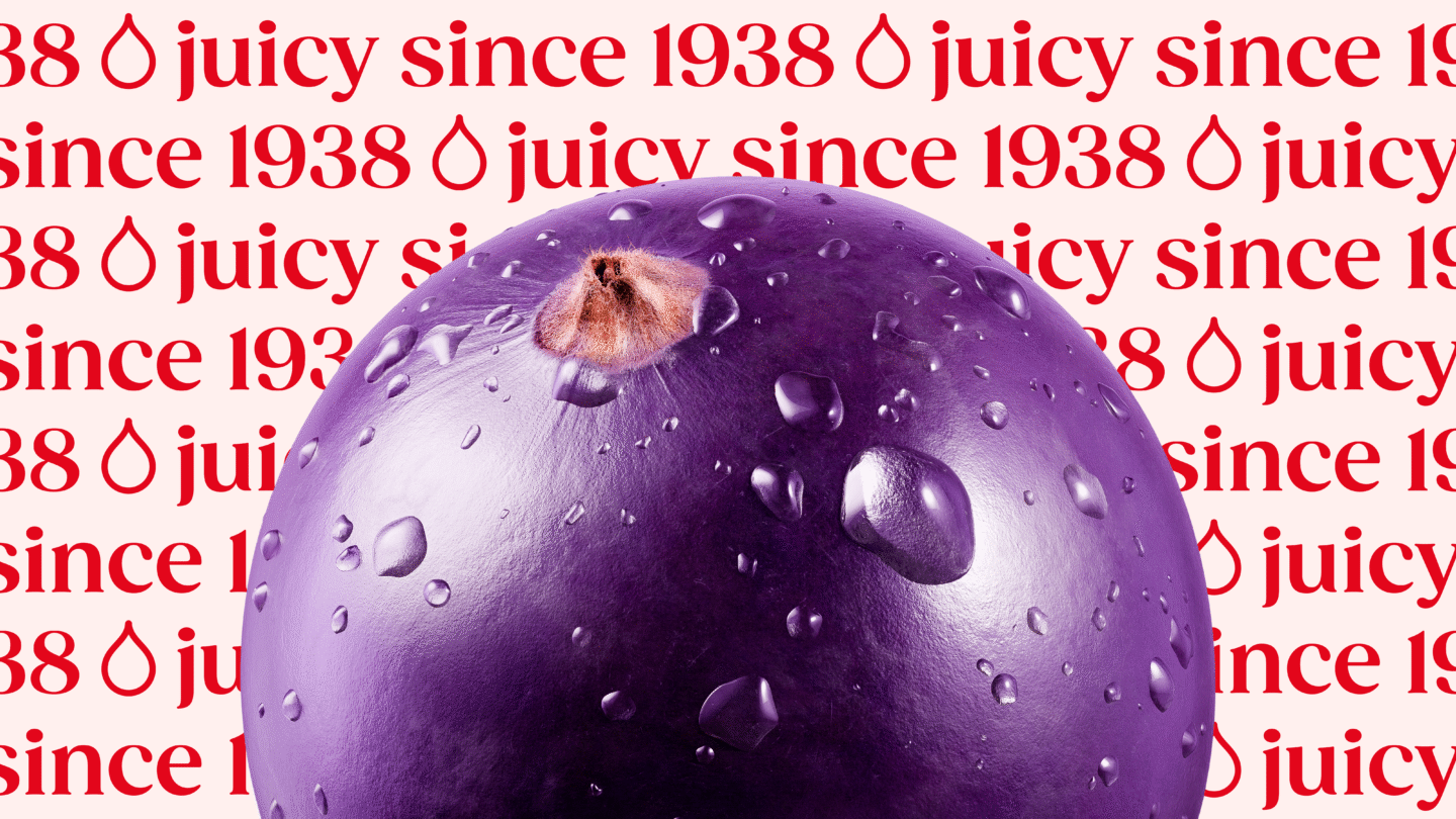
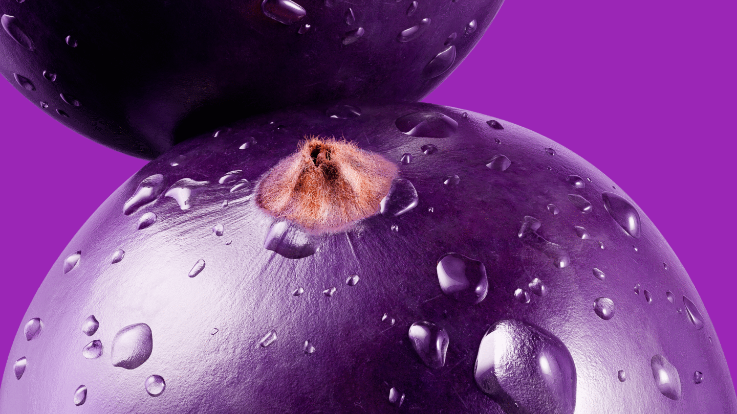
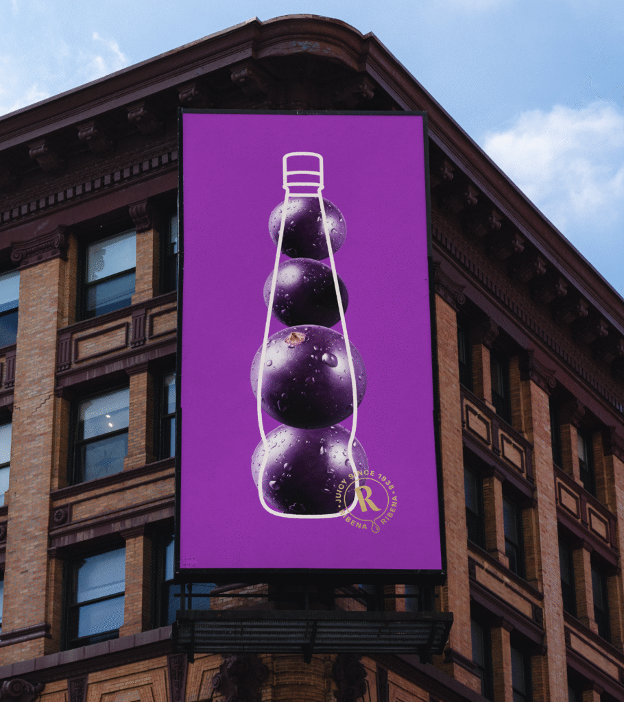
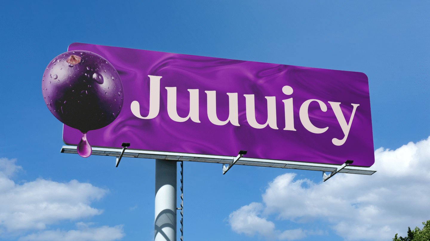
These elements are paired with rich fruit photography that brings to life the full range of flavours, feeding into the logo with a droplet graphic. Acting as a celebration of the fruit at the heart of Ribena’s drinks, these droplets are a window for telling beautiful stories on pack and beyond, a flexible asset that represents Ribena’s unique taste and the memories that it can awaken.
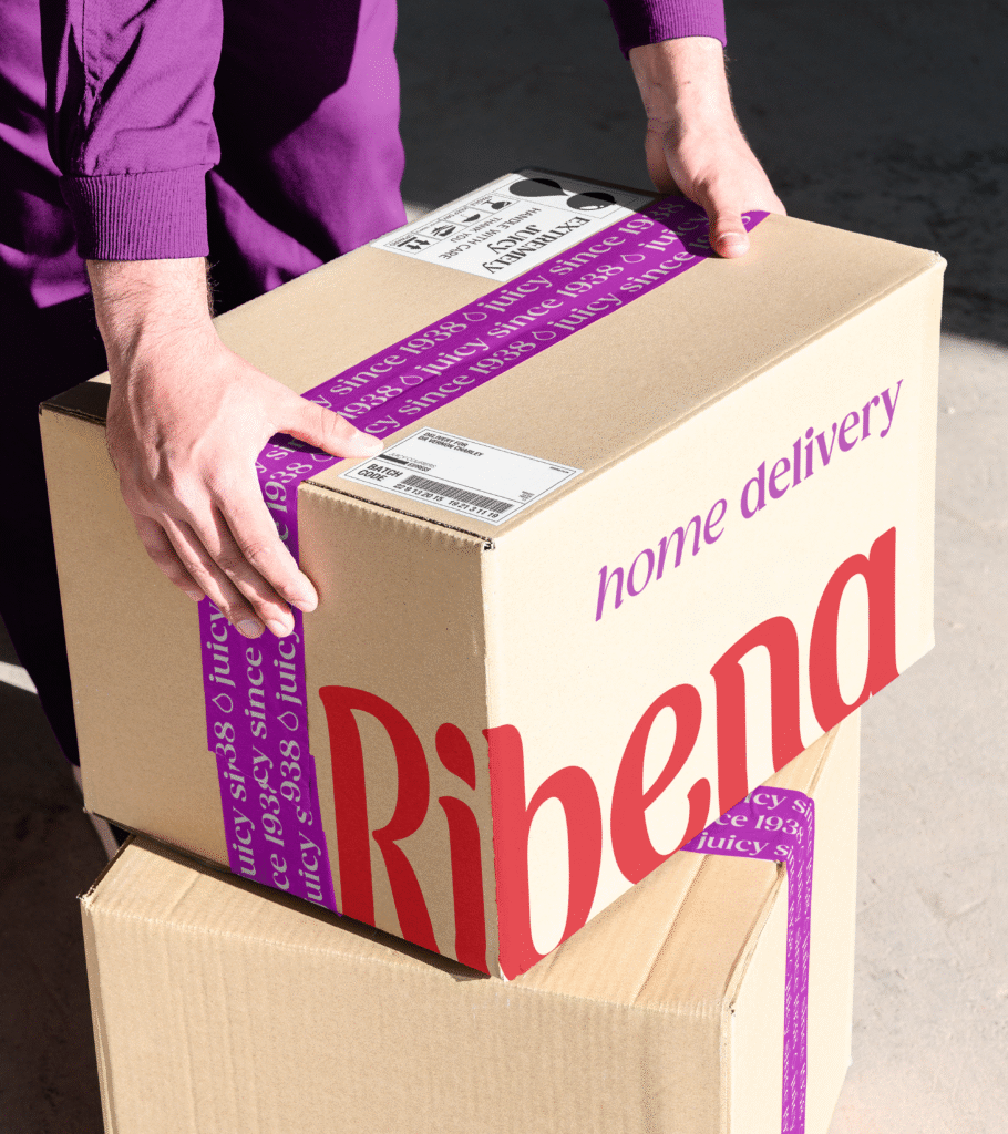
A crucial element of Ribena’s refreshed brand identity is the rich purple background that appears across its packaging, inspired by the blackcurrants that launched the brand. A gold heritage stamp which appears off pack completes the refresh by speaking to the brand’s origins.
The Impact
The result is a beautifully refined and enhanced brand identity that cuts through at shelf, with recrafted distinctive assets that make it recognisably Ribena, and setting the brand up to make many more juicy memories moving forward.
This brand refresh marks an exciting new chapter for Ribena. We wanted to create a look and feel that reflects the vibrancy, care and love that we put into every bottle. Working with Elmwood, we’ve created a bold, joyful and refreshed identity that captures the unmistakable taste and spirit of Ribena – rooted in nature but full of life
Sarah Fleetwood
Head of Ribena