Biela
Friendship as alchemy
Industry
Consumer
Location
USA
Services
Brand Identity, Brand Strategy, Brand World, Packaging Design
Intent
To restore Biela brand and pack as a leader in the category it has occupied for 27 years. To build relevance and affinity through thoughtful reinvention, and uncover a deeper identity with bold new confidence.
The Challenge
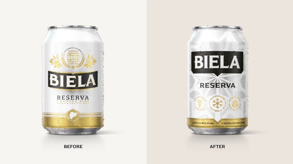
Longevity without distinctiveness is just noise, and in a mainstream beer category dominated by heritage crests, black-and-gold codes, and patriotic platforms already claimed by Pilsener, Biela had become easy to overlook.
Modern Ecuadorians seek real experiences that have more emotional depth through tighter friendship circles, more meaningful social rituals, and a celebration of the wide ranging diversity of their nation. Biela’s existing qualities of being accessible, easy-drinking, and built for connection was our anchor. Yet without a unique point of view, it was just another ‘cold beer’.
The brand had the right qualities, but lacked a voice that resonated with the Ecuadorian people.


The Idea
We positioned Biela around a single, organising thought—Friendship as Alchemy. Just as master brewers transform simple ingredients into something greater through time, patience, and craft, true friendships are forged through shared moments, unlikely combinations, and the slow accumulation of trust. Biela doesn’t just brew beer. It brews bonds.
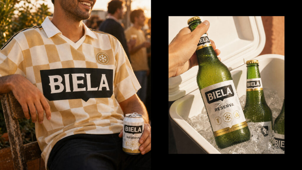
The visual identity is rebuilt around a bold, amplified logotype housed in a flag-shaped holding device, an element that was evolved from Biela’s original shield into a confident and ownable brand beacon. The flag therefore grew in meaning to be the system’s engine. It frames candid moments of connection, carries typography, and anchors the brand consistently from pack to out-of-home moments. It gives Biela something the category lacks entirely, which is a truly flexible and singular asset built for a modern world.

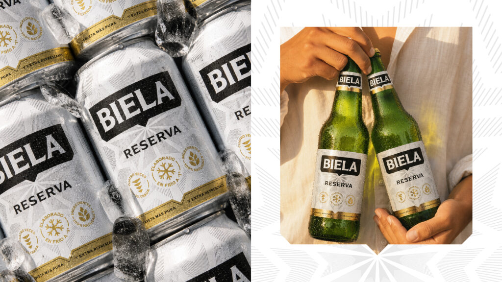
We stripped away the visual clutter of mainstream beer convention and introduced a restrained, premium palette – Blanco Helado, Biela Black, Oro Puro, and Plata Artesanal. A radiating sunburst pattern runs through the system, a nod to the alchemy concept: energy emanating outward from the brand’s core. A bespoke icon suite communicates renewed product credentials directly on pack – cold-brewed at -1°C, four-times filtered, 100% natural ingredients – grounding the modern aesthetic in functional truth.
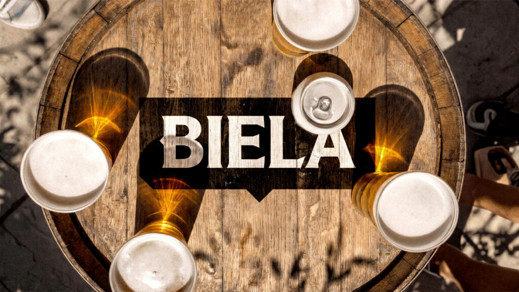
Photography principles complete the system. Golden-hour warmth, mid-motion candour, unconventional framing, hands as proxies for connection. The brand inhabits the moment rather than interrupting it.
White and gold in a black-and-gold category. Clarity in a sea of noise.


The Impact
The result is a complete visual identity system that breaks decisively from mainstream beer conventions across Ecuador. Where the category defaults to heritage crests and dark, traditional codes, Biela now commands attention through simplicity, warmth, and confidence – a challenger that no longer looks like one.
The flag device and reimagined wordmark resolves the central creative tension of the brief: iconic but recognizable, modern but not anti-traditional, elevated but genuinely accessible. Biela is no longer a brand getting lost in a crowded category. It’s the alchemy of friendship.